Product design & customer research, Fjord · Financial services · 2018

Bank investor research

Bank of America had three separate research products serving portfolio managers, traders, and analysts. Fjord was brought in to turn them into one iOS experience.

My role was more player than coach on this project. I worked from interviews and synthesis through the feed, research reports, flows, visual and interaction design, prototyping, and the shared design system with the team.

We handed off a detailed phase 1 product definition and interactive prototype that the technical team had vetted as feasible.
By Skipper Chong Warson · Published 2 Jan 2025 · Updated 7 Sep 2026

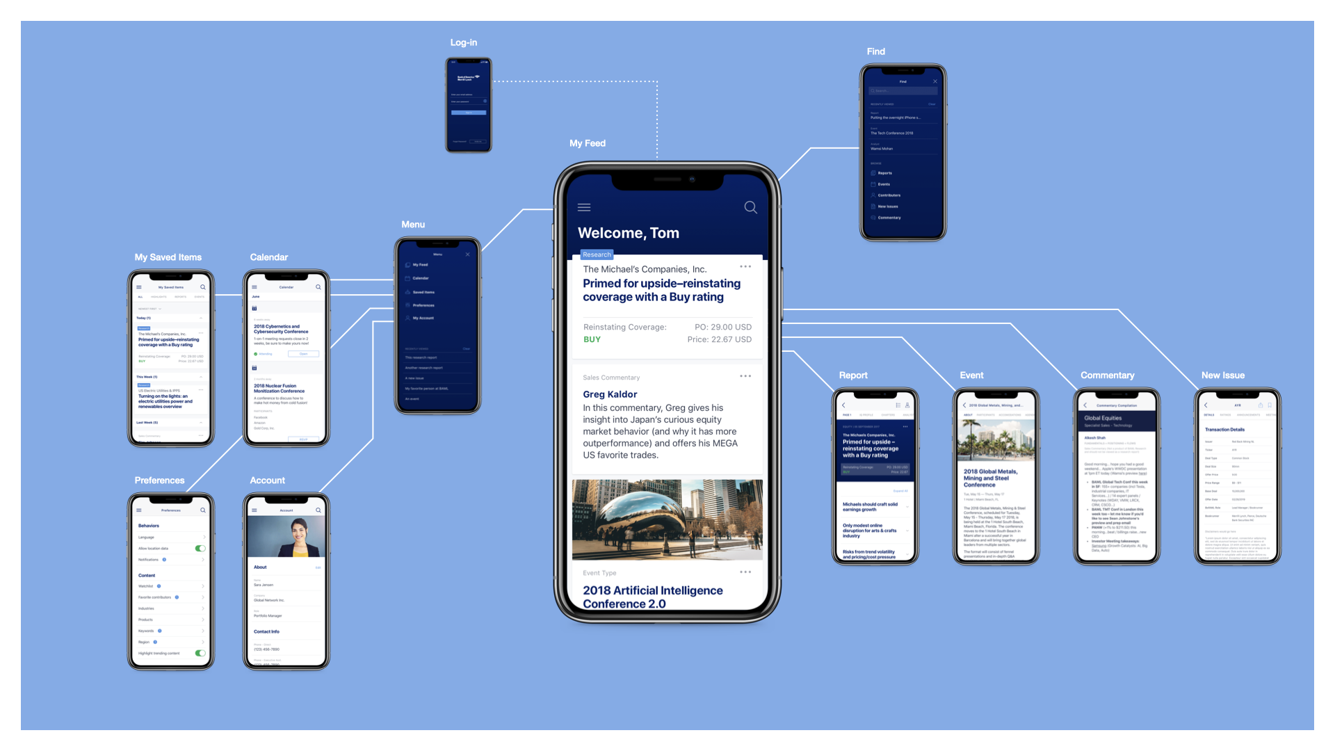
Overview of the consolidated Bank of America research app

Three products had to feel like one

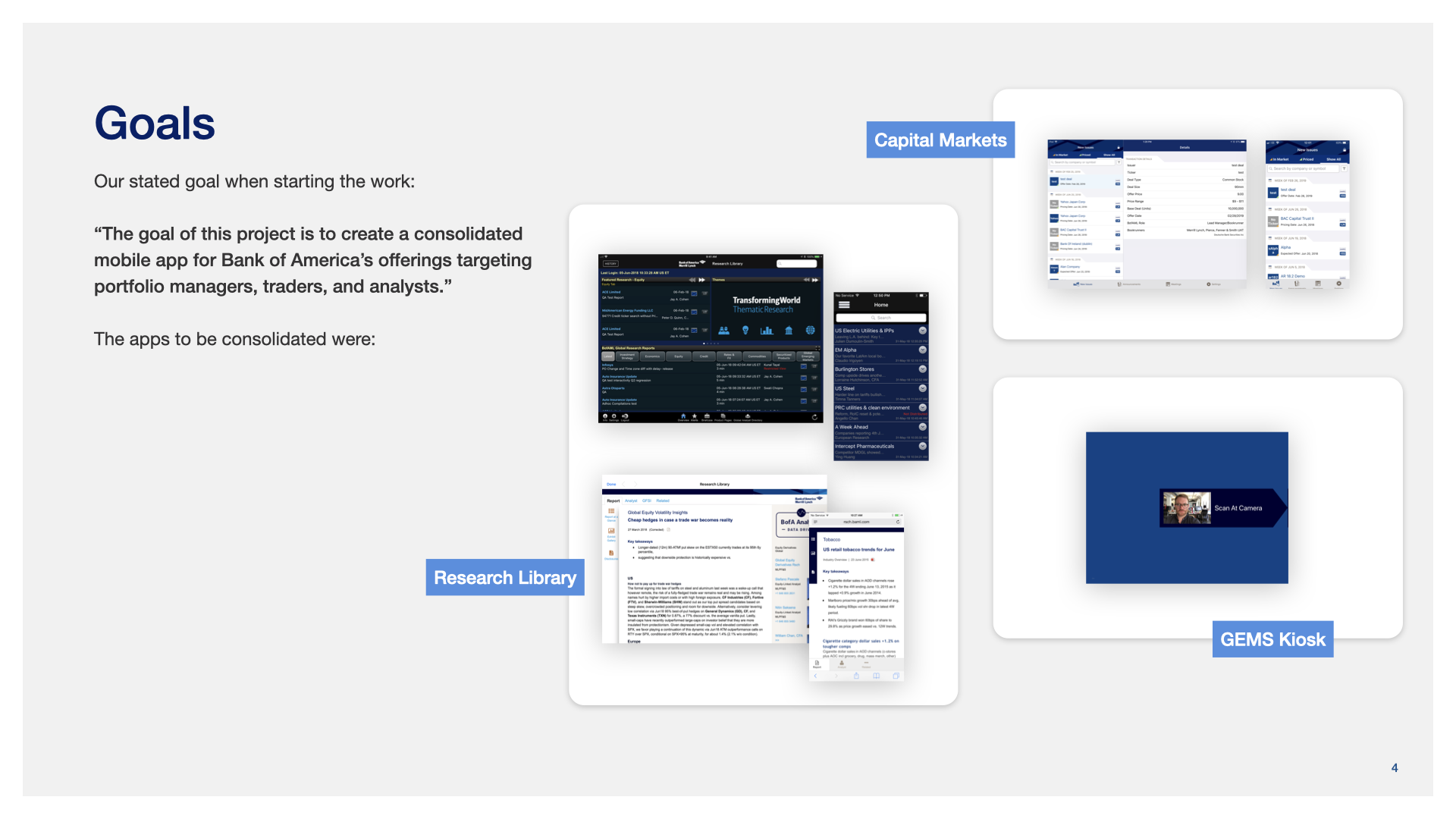
Research Library, Capital Markets, and GEMS Kiosk did not map neatly onto one another. Clients moved among reports, market commentary, events, deals, and other information, often alongside tools they already used. The brief was consolidation; the design question was what belonged together.

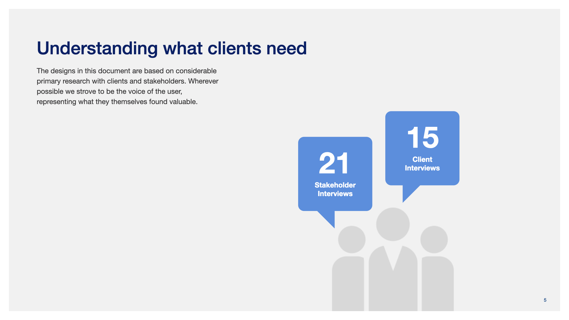
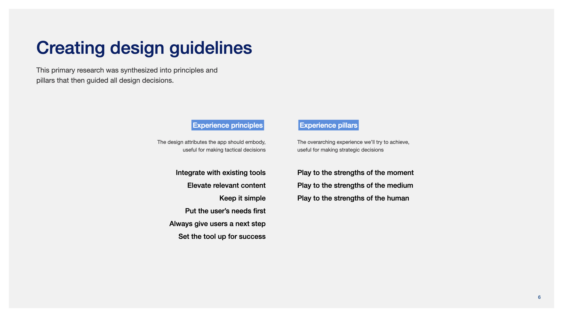
We interviewed 21 stakeholders and 15 clients. The interviews gave us four useful constraints: work with the tools people already had, surface what mattered, keep it simple, and always give them somewhere useful to go next.

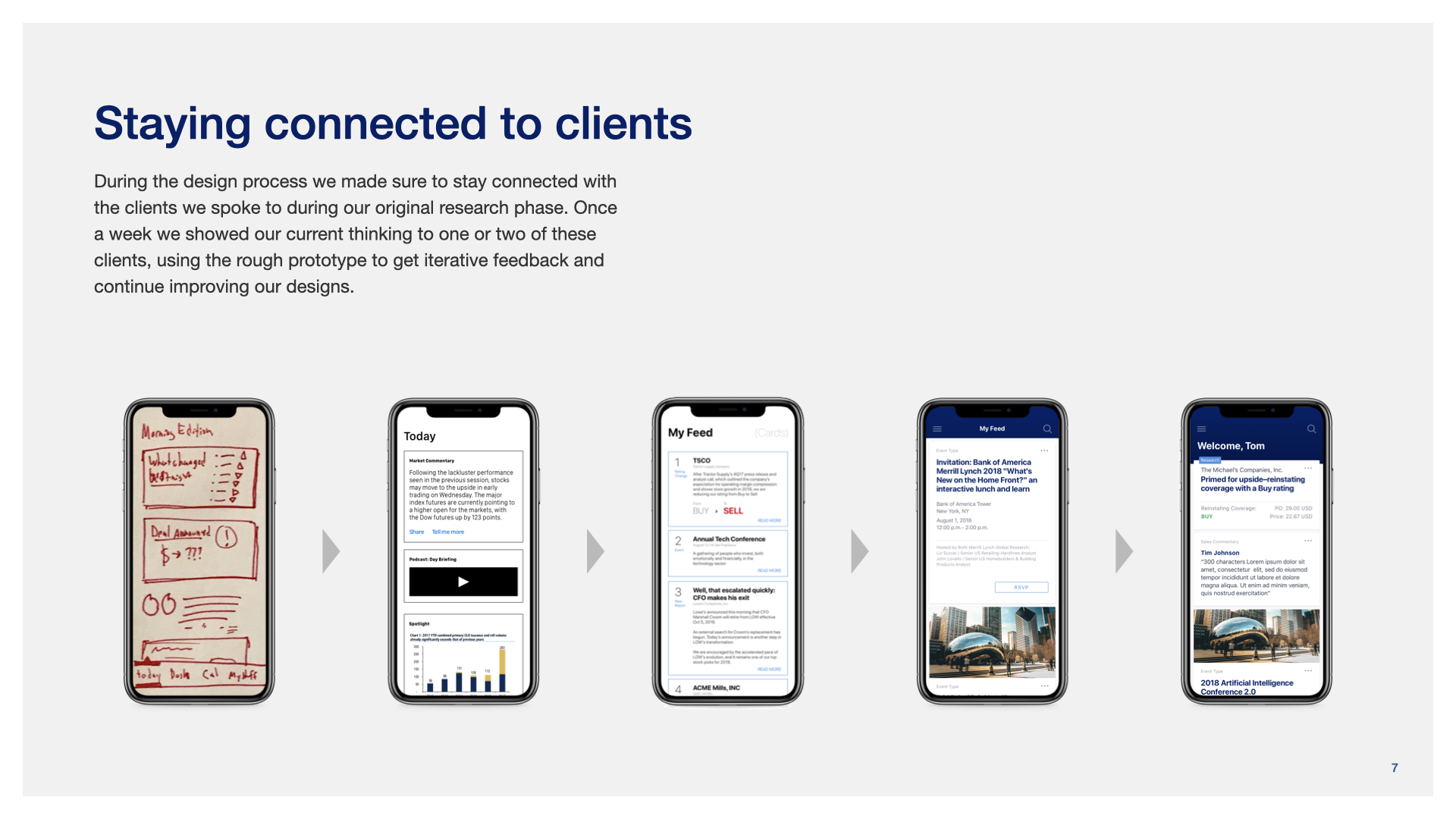
The research did not end when design began. Each week, one or two of the original participants saw the evolving prototype and told us what was working and what was not.

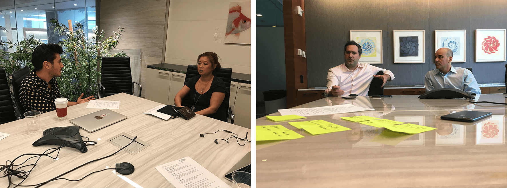
Bank of America clients participating in research interviews
We spoke with clients and stakeholders before design began, then returned to participants as the prototype developed.

The work at a glance

Start with what matters now

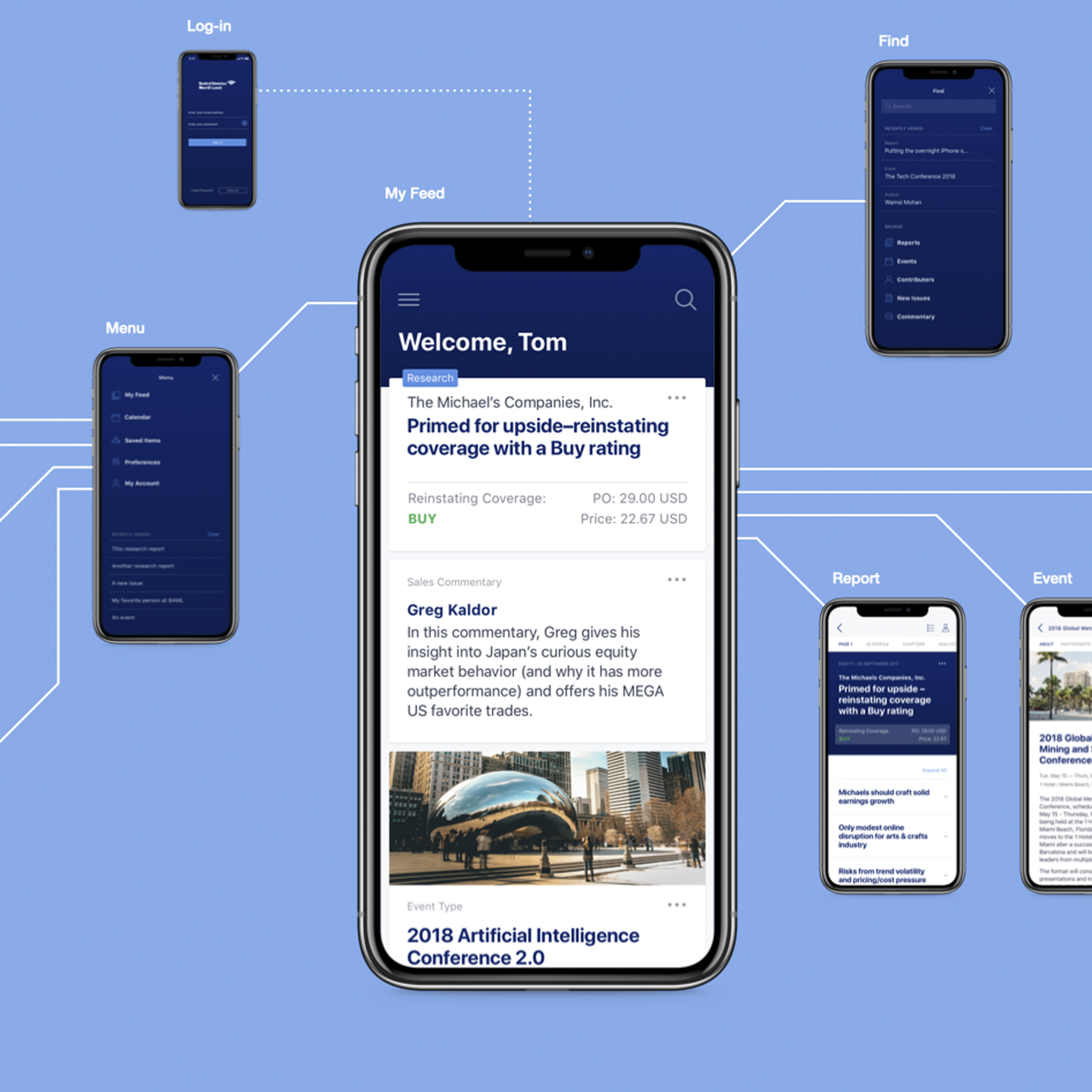
The Feed became the center of the experience. Rather than asking someone to choose a legacy product first, it brought a small number of relevant items together: research reports, market commentary, upcoming events, new issues, and rating changes. From there, people could decide what deserved more attention.

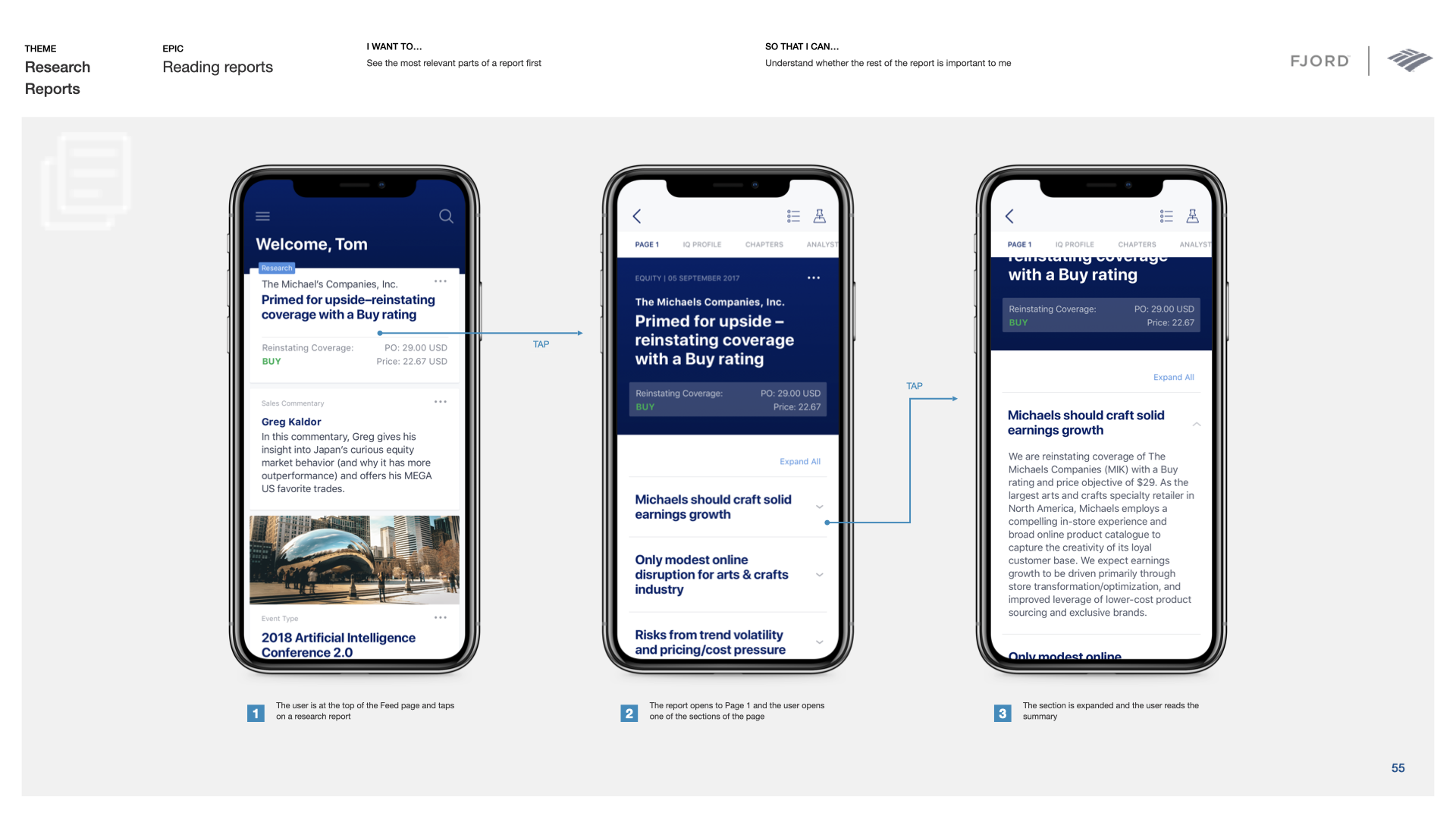
Bank of America research app Feed and detailed report-card anatomy
The Feed mixed several content types in one personalized stream instead of reproducing the boundaries between the three source products.

Make dense reports easier to use

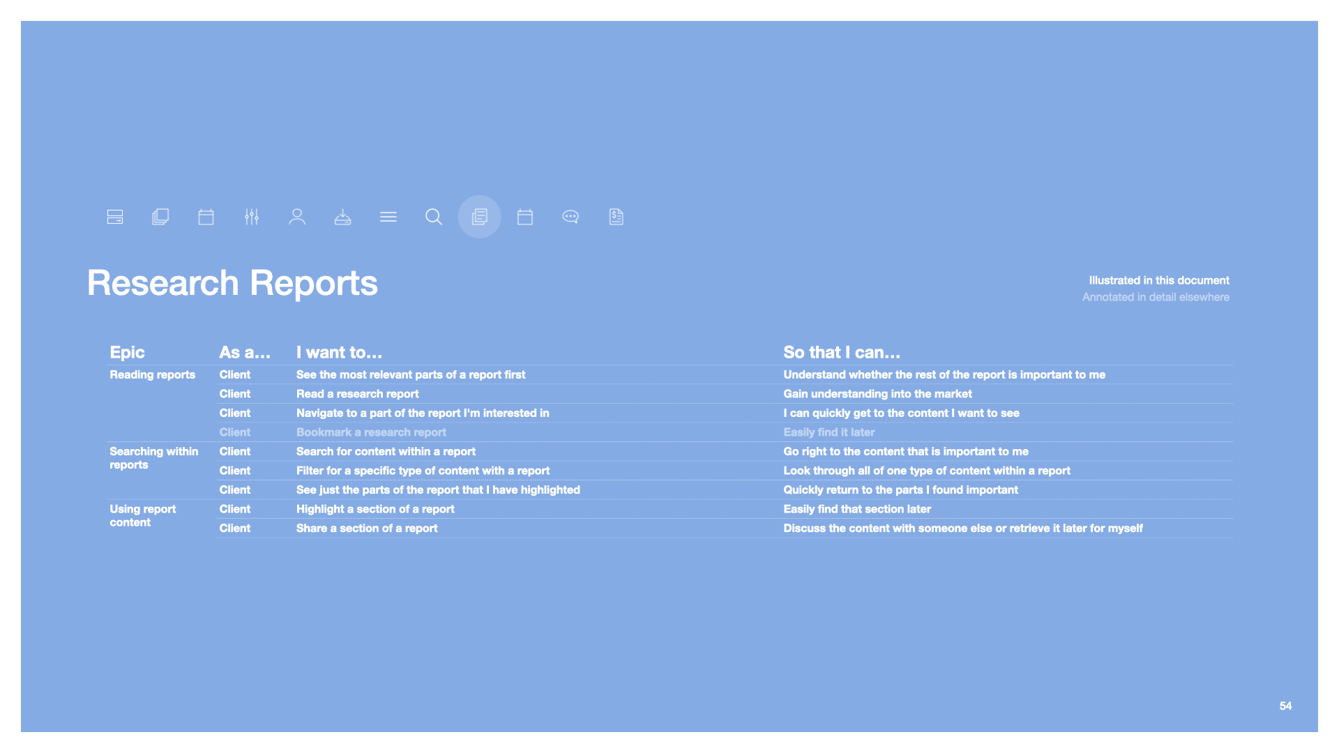
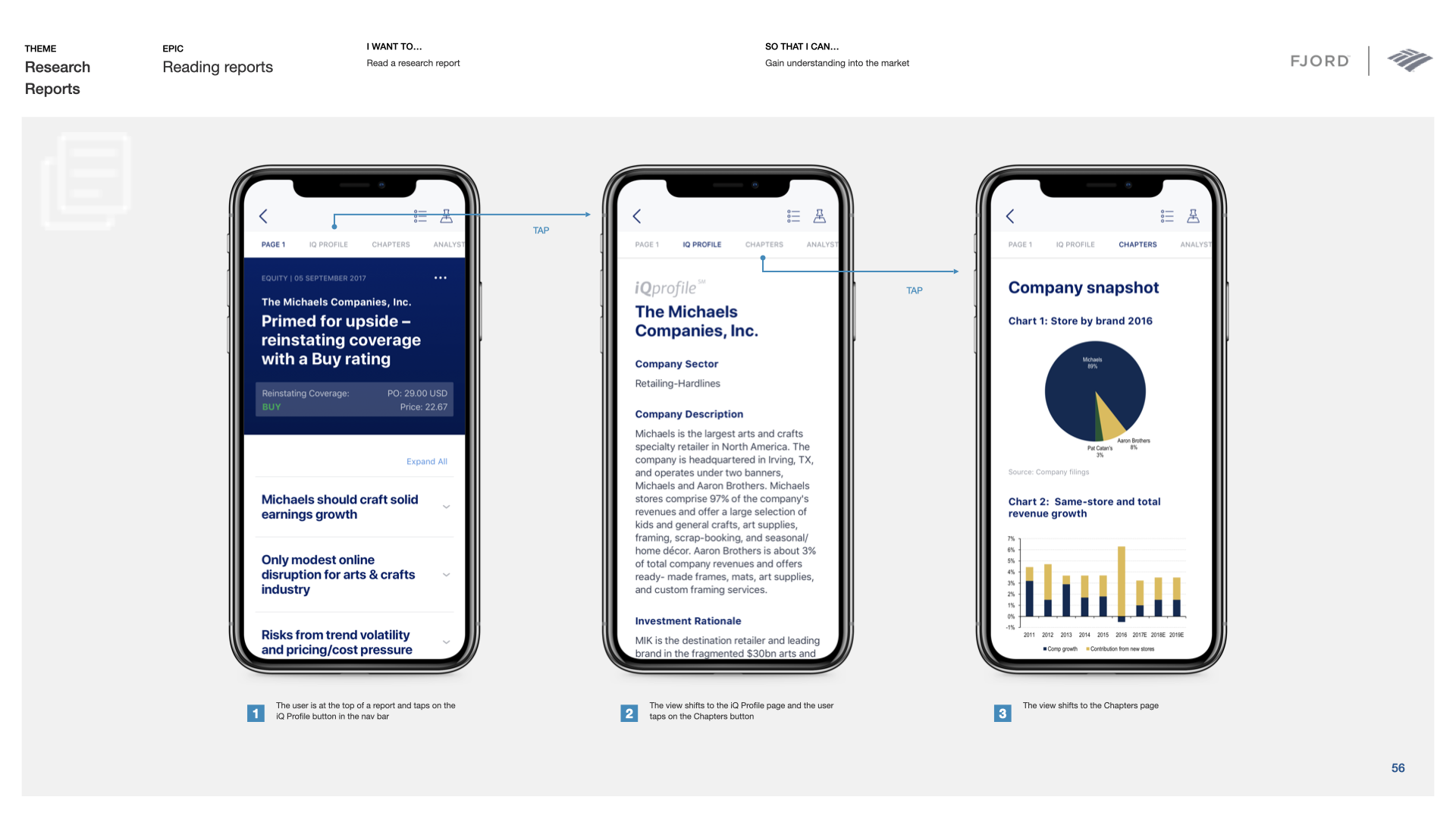
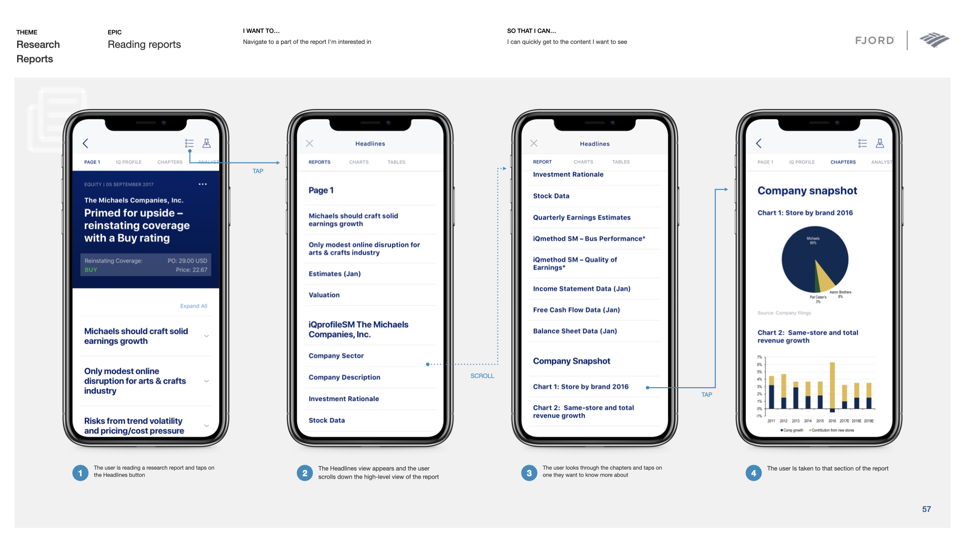
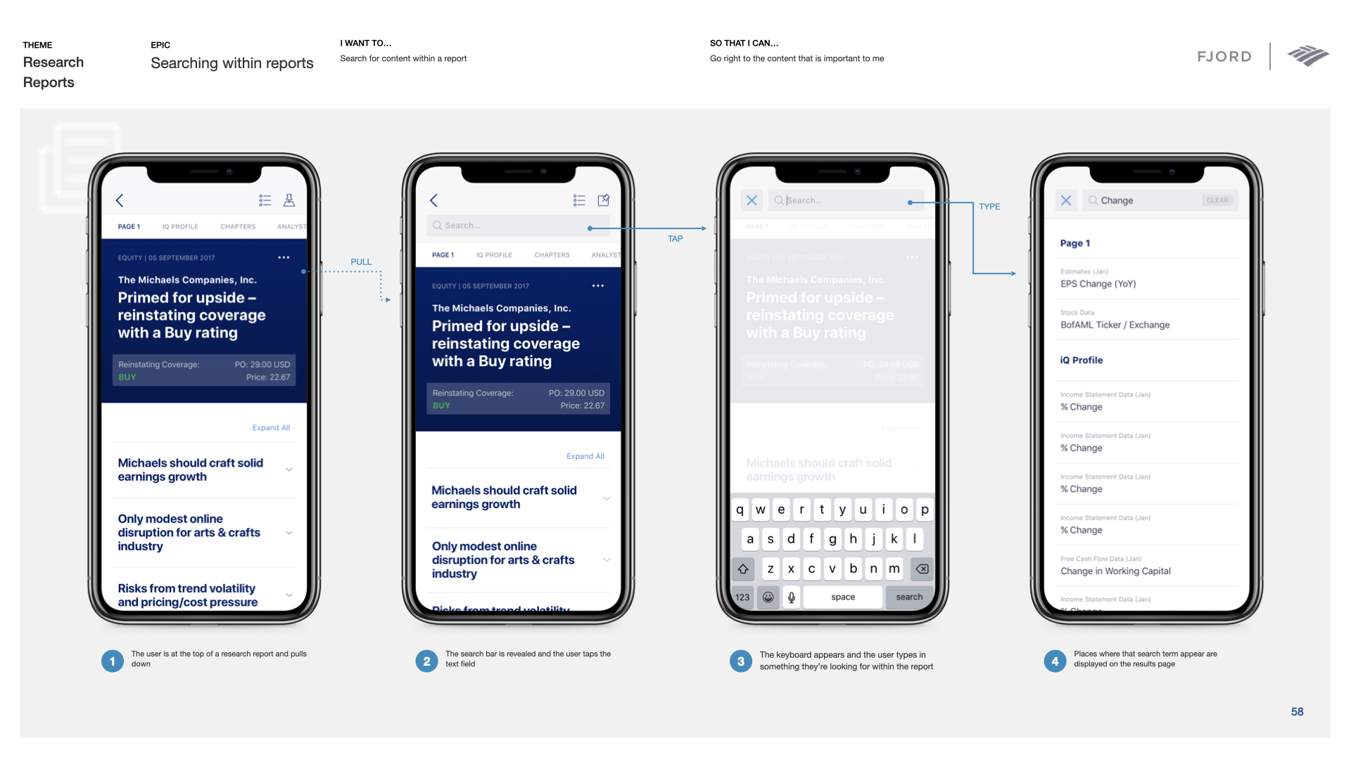
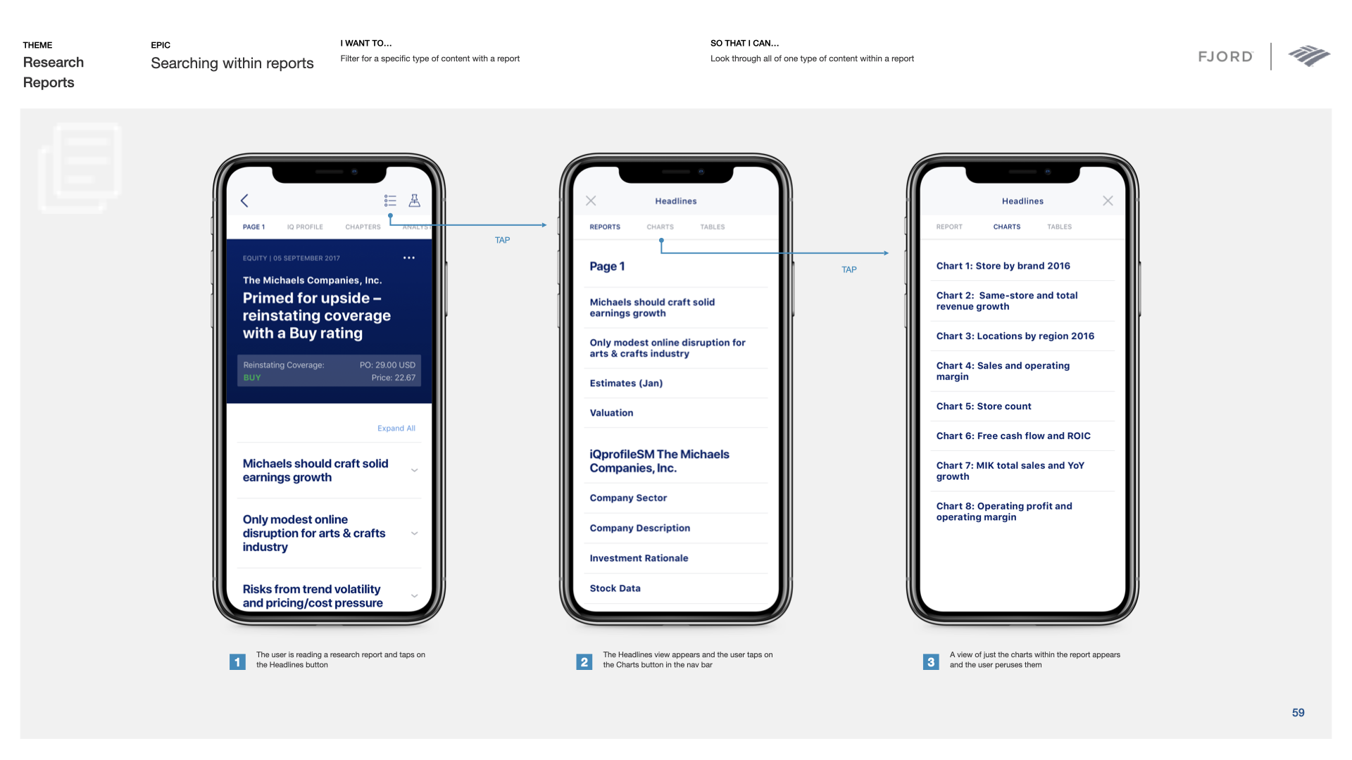
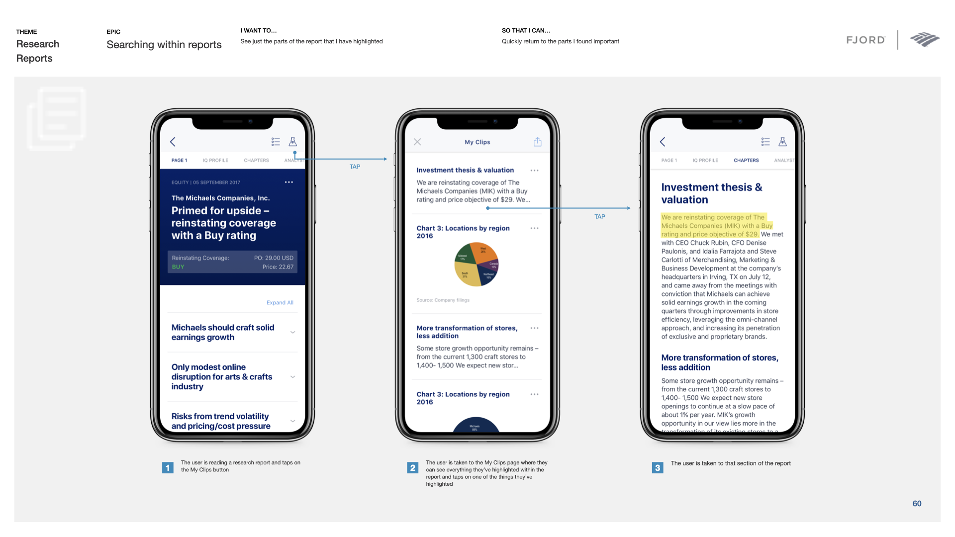
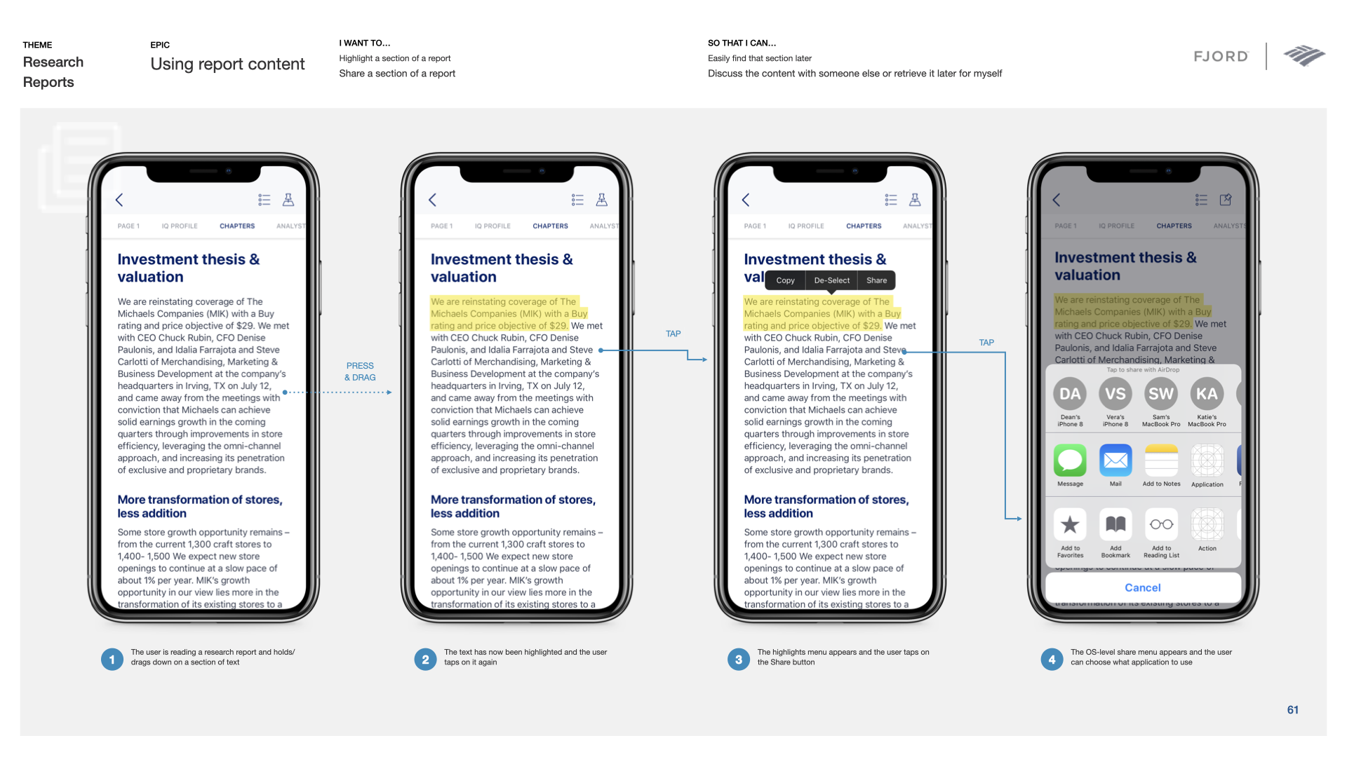
Research reports were the hard case. They were dense, but clients did not always need to read them from beginning to end. We designed ways to scan the important parts, move among chapters, search within a report, isolate charts, highlight passages, save material, and share it into another workflow.

I worked directly on the Feed and report experience shown here, as well as the flows, interface, prototype, and shared system connecting them.

A phase 1 product ready for handoff

The final delivery included the product designs, detailed interaction flows, an interactive InVision prototype, animation documentation, and the shared Sketch design system. The technical team had vetted the intended experience as feasible for phase 1.

The team defined that first release as a minimum lovable product and separated additional research-driven ideas into a backlog for later iterations. I left at handoff, so that is where my direct knowledge of the product’s launch and adoption ends.

Research, structure, and interaction

The engagement moved across what belonged in phase 1, how the product should be organized, and how someone moved through a dense report on a phone.

I stayed hands-on through all of it. Product decisions, interaction details, the stuff between them. That’s why the work still holds up for me.