Founding product design & customer research · Healthcare · Aug 2018–Aug 2019
Sesame
A direct-pay healthcare marketplace with a conference prototype due in January 2019, a Kansas City beta immediately after, and one in-house design hire to help get it there.
I inherited early mobile concepts from Prolific and turned the thesis into something patients could search, compare, book, and pay through, while providers exposed real availability on the other side.
Sesame's bet was simple to explain and harder to make usable: shop for care the way you shop for anything else. See the price before you commit. Find an appointment. Pay upfront. No insurance in the middle. Providers could sell time that would otherwise go unused.
The dates did not move. We needed a working prototype for the J.P. Morgan Healthcare Conference on 7 Jan 2019 and a Kansas City beta shortly afterward. Sesame was fewer than 10 people, working from a Brooklyn Heights WeWork. There was no dedicated researcher or recruiting panel.
Guessing looked more expensive than talking to people.
Research became part of shipping
Every other Friday, we went downstairs with three $20 Amazon gift cards and recruited three people for roughly 40 minutes each. On Thursday we looked at the open questions. By Friday morning we cut them to five to seven. What we carried changed with the question: competitive screens, paper sketches, sticky notes, or a Figma prototype.
Anyone on the team could observe: founders, product, engineering, contractors, our copywriter. One person interviewed. No pitching, no demos.
Open questions→3 conversations→Shared observation→Change requirement→Design + build→Test again
That mattered because the people making the product heard the same thing at the same time. One Friday, a near-term booking interaction was incomprehensible to the participants. A co-founder, our head of product, and I were already in the room. We changed the requirement that afternoon, redesigned it, and had a new version coded and back in testing within days.
Across the pre-launch period I conducted 21 interviews for about $400 in incentives.
The sample was imperfect. We were talking to tech workers in Brooklyn who were more likely to have insurance than the cash-pay customers we expected in Kansas City. I used that audience to test usability. Willingness to pay still needed better evidence. If I were screening it today, I would add one more question: have you ever paid for a medical visit entirely in cash?
Friday afternoon on the common floor, Brooklyn Heights. Product decision-makers were close enough to the evidence to act on it.
From sketches to beta
The marketplace was selling perishable inventory: appointment times. People needed to understand when they could actually get care and what to do when today did not work.
We explored ways to expose availability directly in search results. The version we landed on showed three dates first — today and the next two days — with appointment times grouped underneath and a control to move farther ahead. On mobile, the same model compressed into a small date strip; on desktop it expanded alongside provider details and the map.
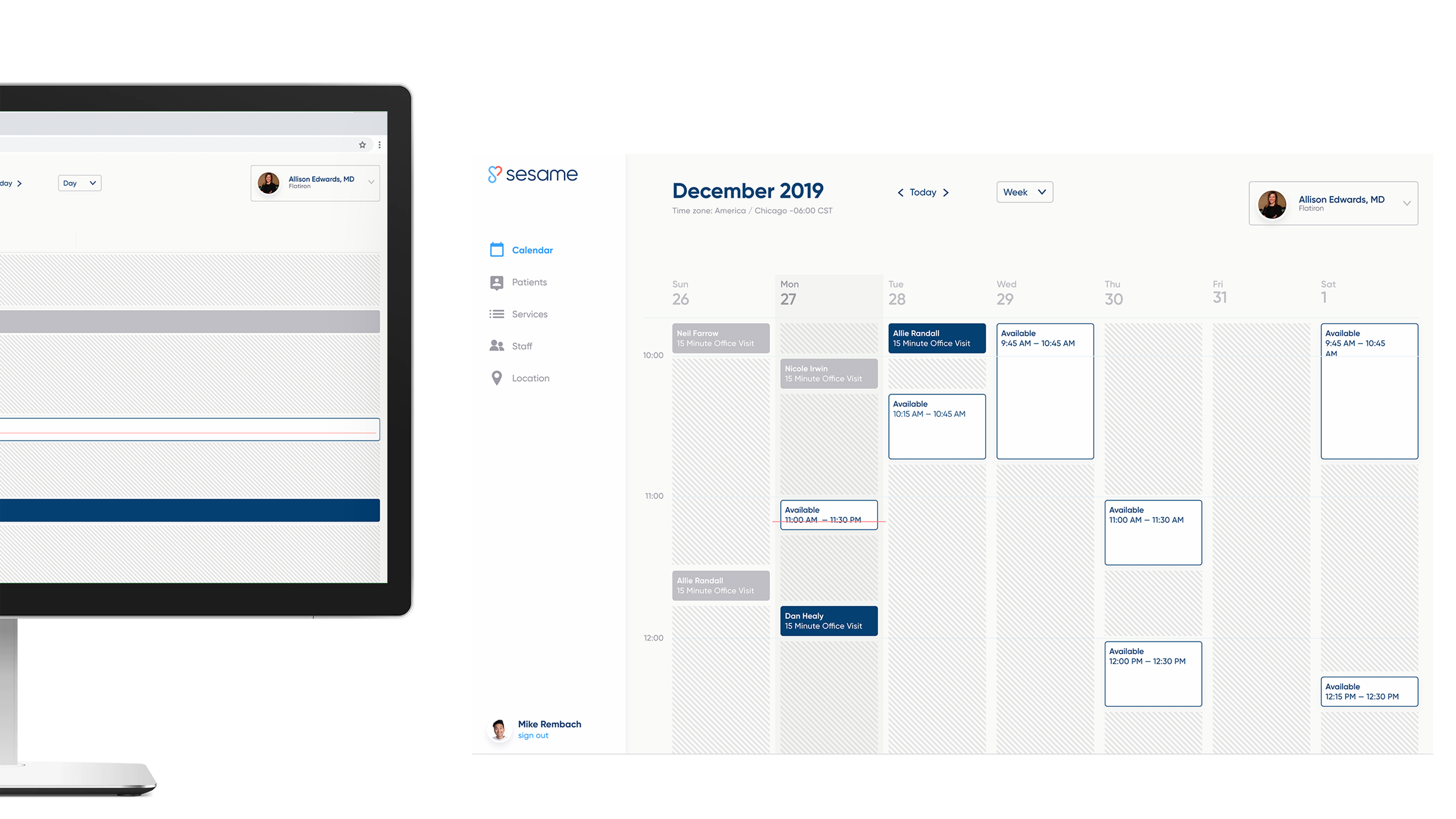
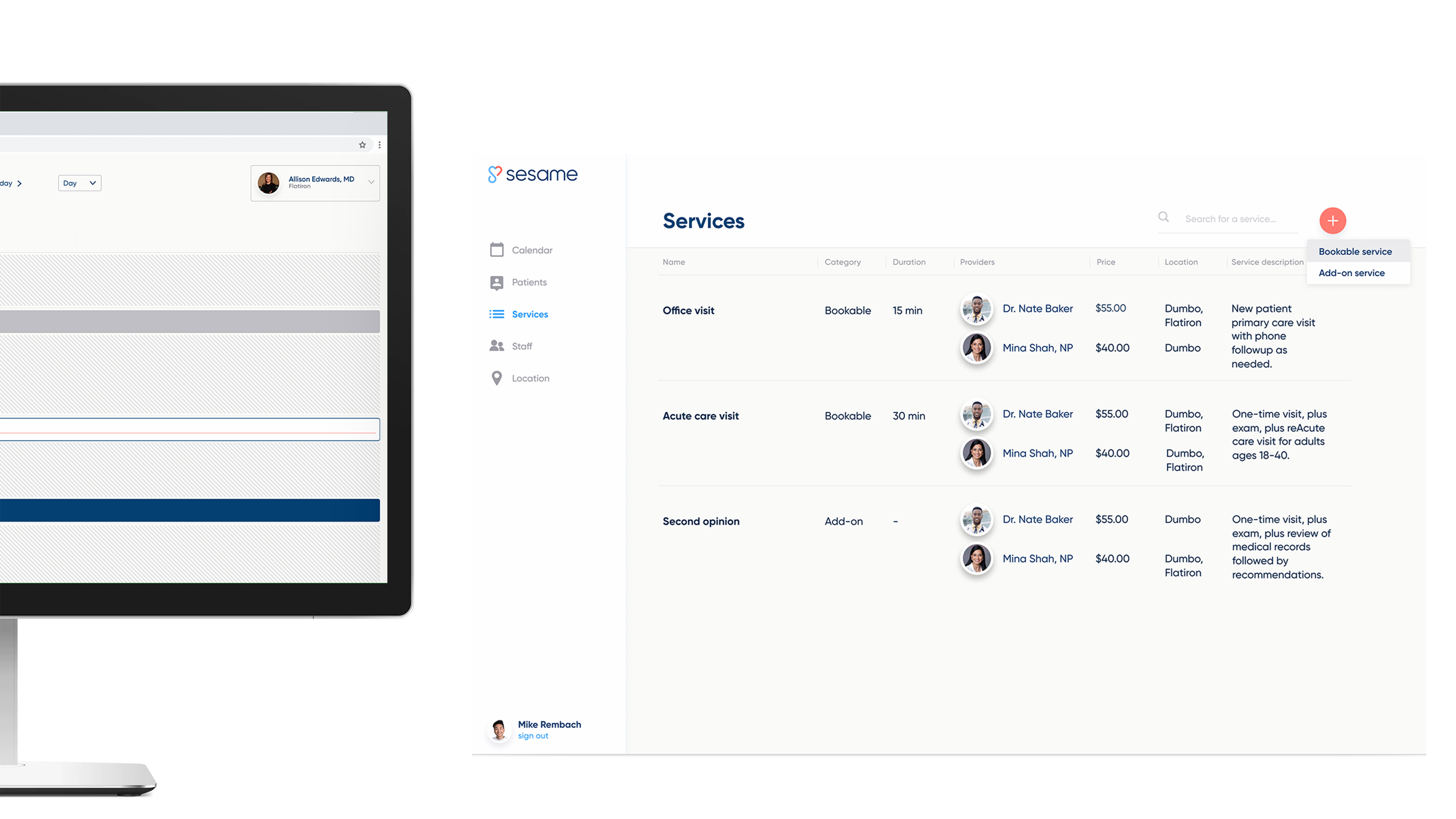
The beta also had to work on the supply side. We tested provider-facing prototypes with a physician advisory council and worked through services, locations, staff, pricing, booked time, and the availability providers wanted to sell.
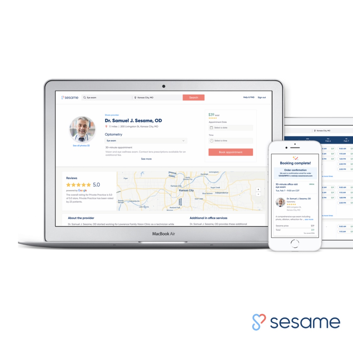
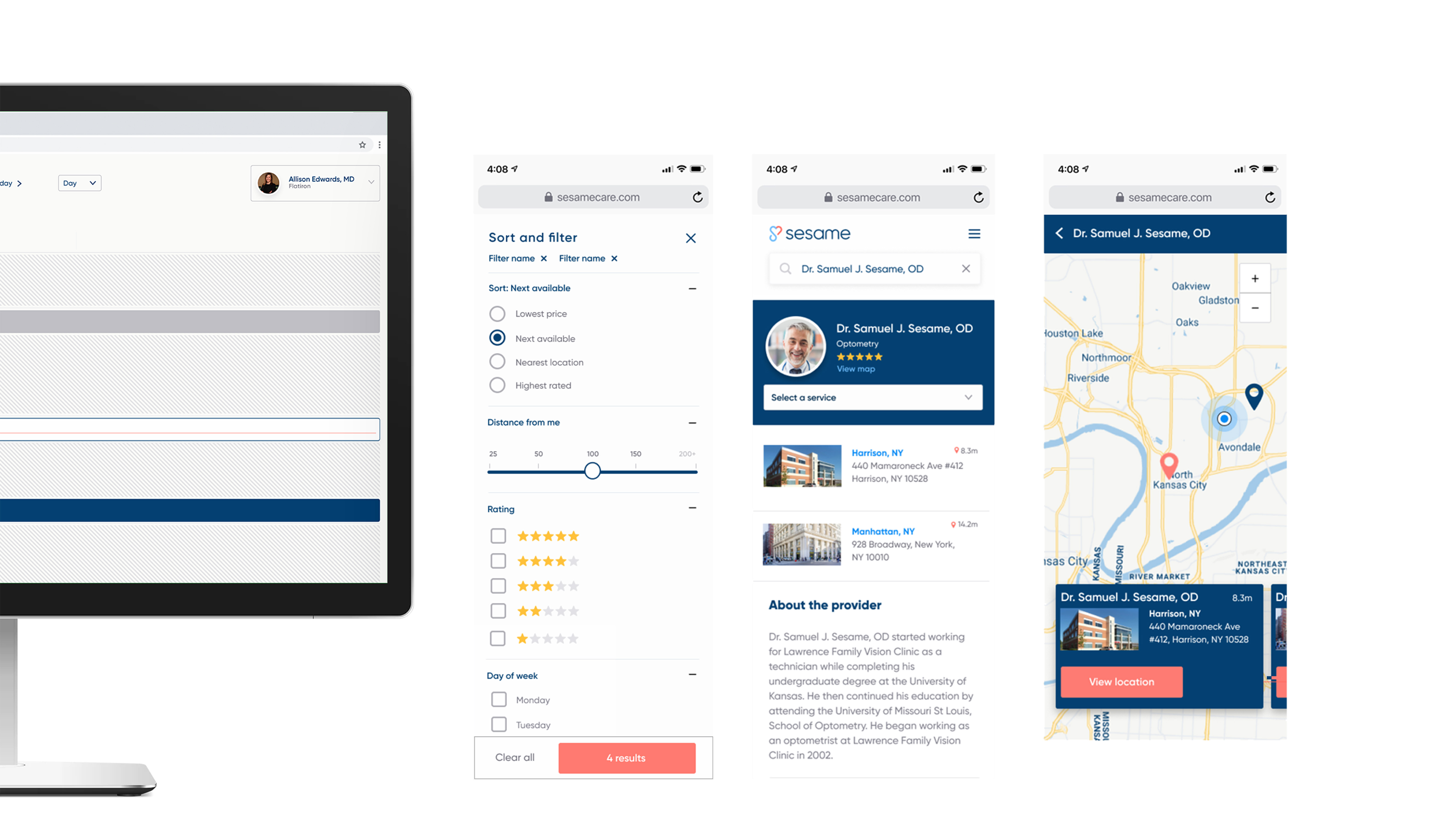
Mobile patient discovery. Search, sort, filter, provider detail, and map exploration.
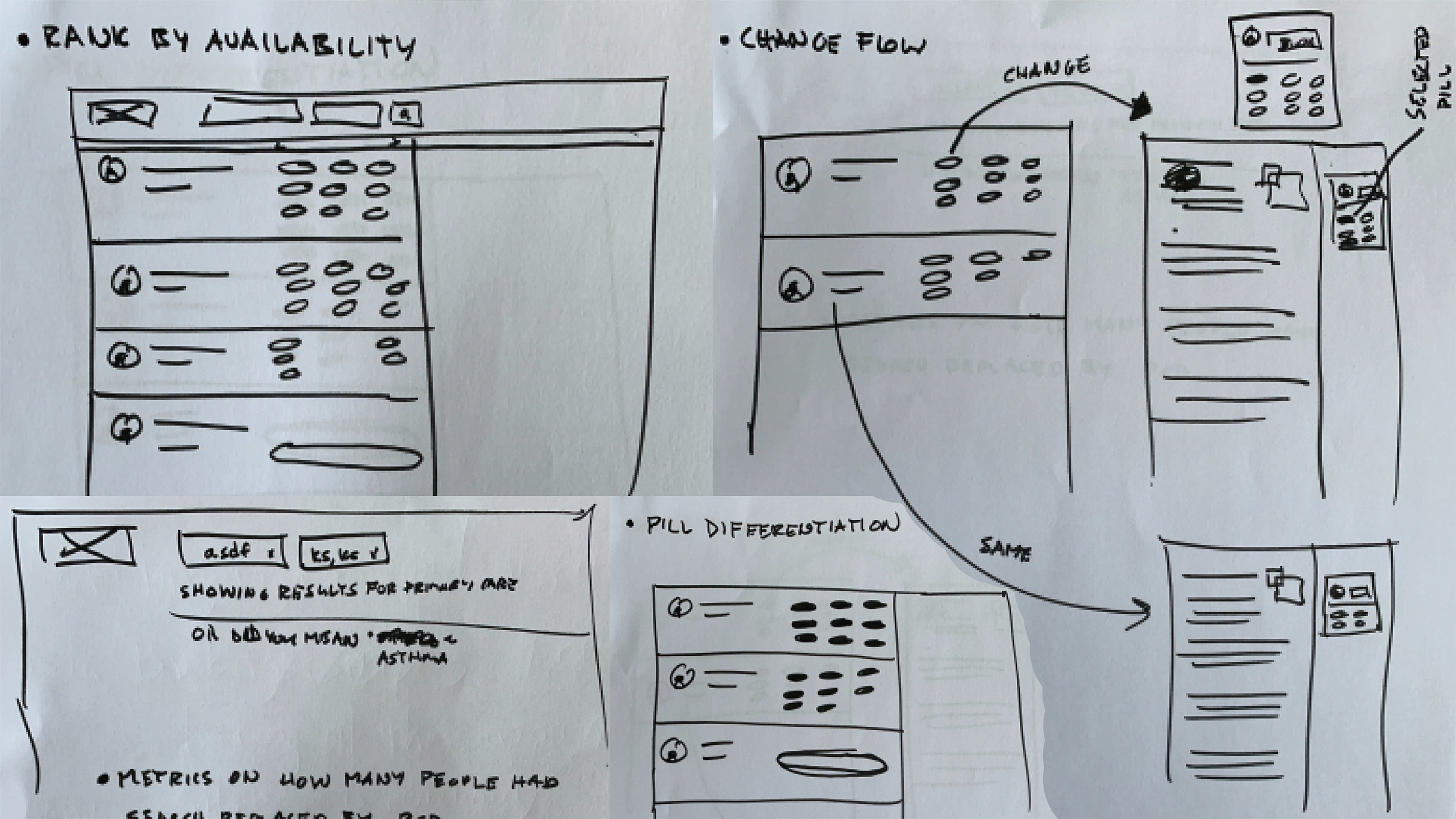
Speedy sketches. Availability ranking, time-pill differentiation, and alternate search flows.
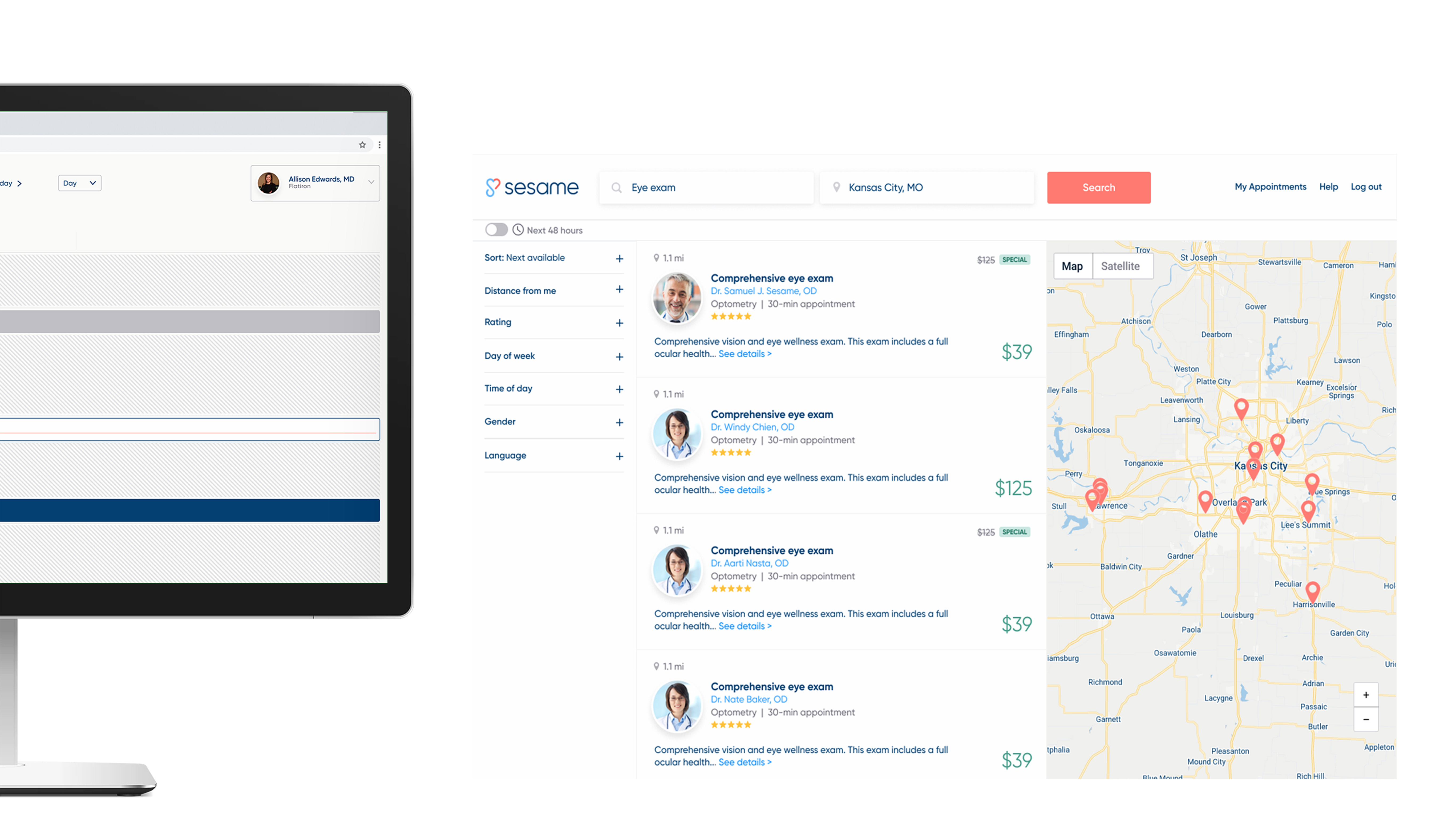
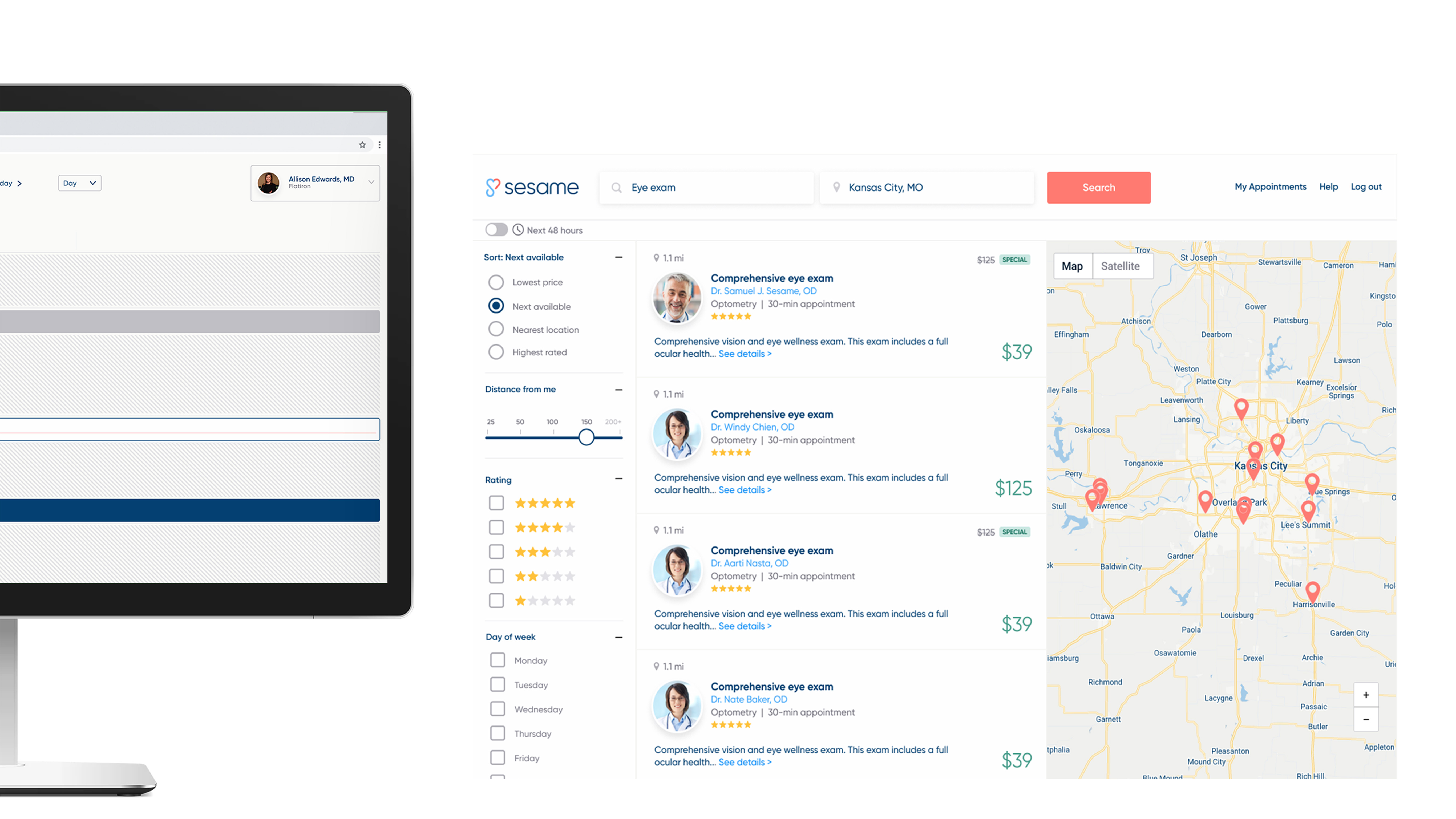
Desktop search. Provider results, next-available sorting, and location in one view.
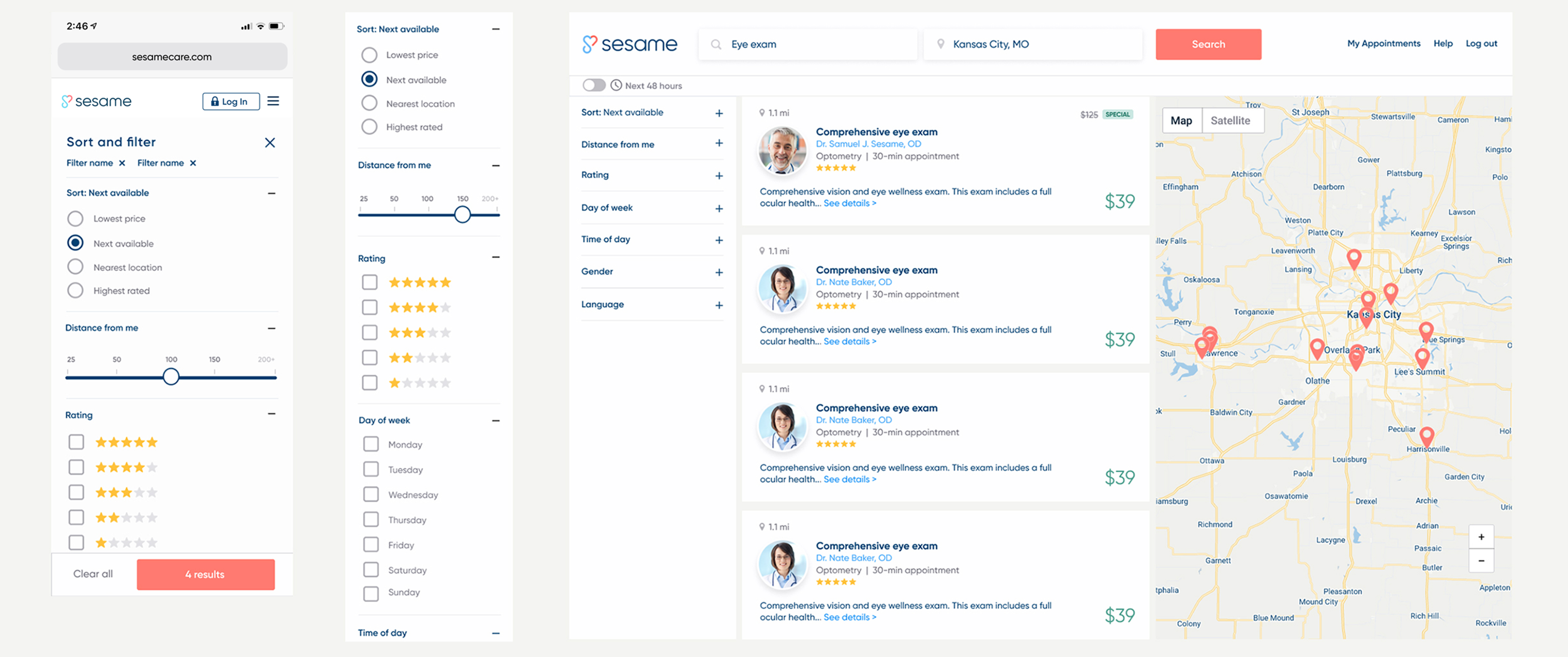
Filtering. Sort order, distance, rating, day, time, gender, and language.
Provider availability. Booked time and open inventory in the same calendar.
Provider services. Bookable and add-on inventory across providers, prices, and locations.
A missing shopping basket
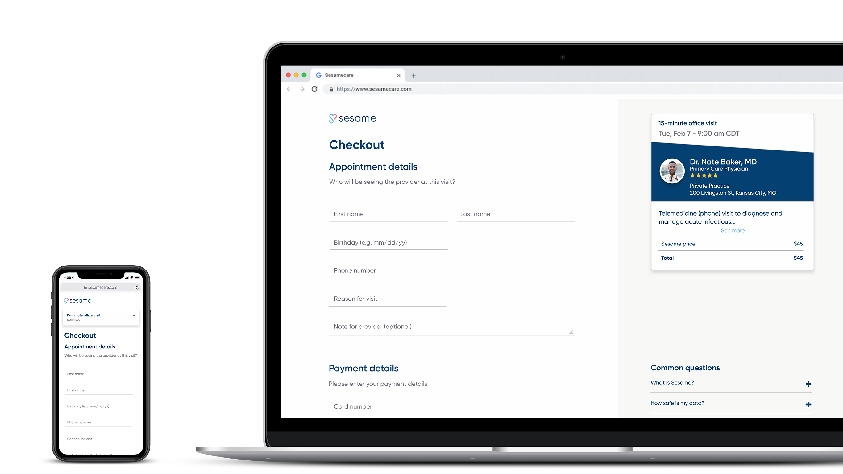
After the Kansas City beta, Hotjar recordings showed another pattern. People would get close to checkout, move around the upper-left area of the page as if they were looking for something, and then the recording would end.
The recording showed us where the problem happened. We used roughly 9–11 UserTesting.com sessions to understand why and watched the same behavior again. Our hypothesis was that people wanted to review what they were buying before committing.
We introduced a shopping basket that kept the appointment context visible through checkout. Cart abandonment had been roughly 90%. After the basket launched, it fell to below 50%.
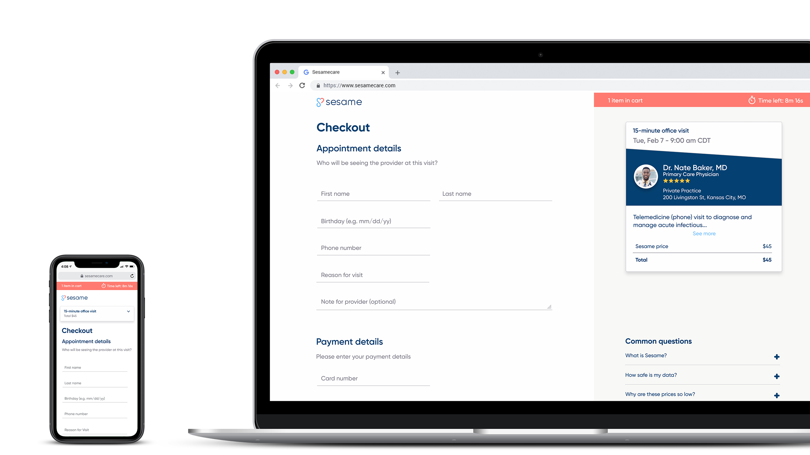
Before. Checkout had no persistent shopping-cart state.
After. The basket and timer keep purchase context visible through checkout.
That loop — behavioral signal, qualitative follow-up, product change, measured result — became the kind of post-beta work I wanted the team to be able to do continuously.
Macaw: enough system to move fast
The beginnings of our design system were in place for the Kansas City beta. Jane, a contract designer, and I outlined the initial components in Figma. Evan, our front-end developer, implemented them in Storybook. I reviewed the implementation against the designs and refined the Figma source as the product changed.
After beta, we accelerated the system alongside the product. Macaw connected Figma and Storybook through Chromatic and gave design and engineering a shared vocabulary while search, booking, and provider tooling kept moving.
Designing past launch
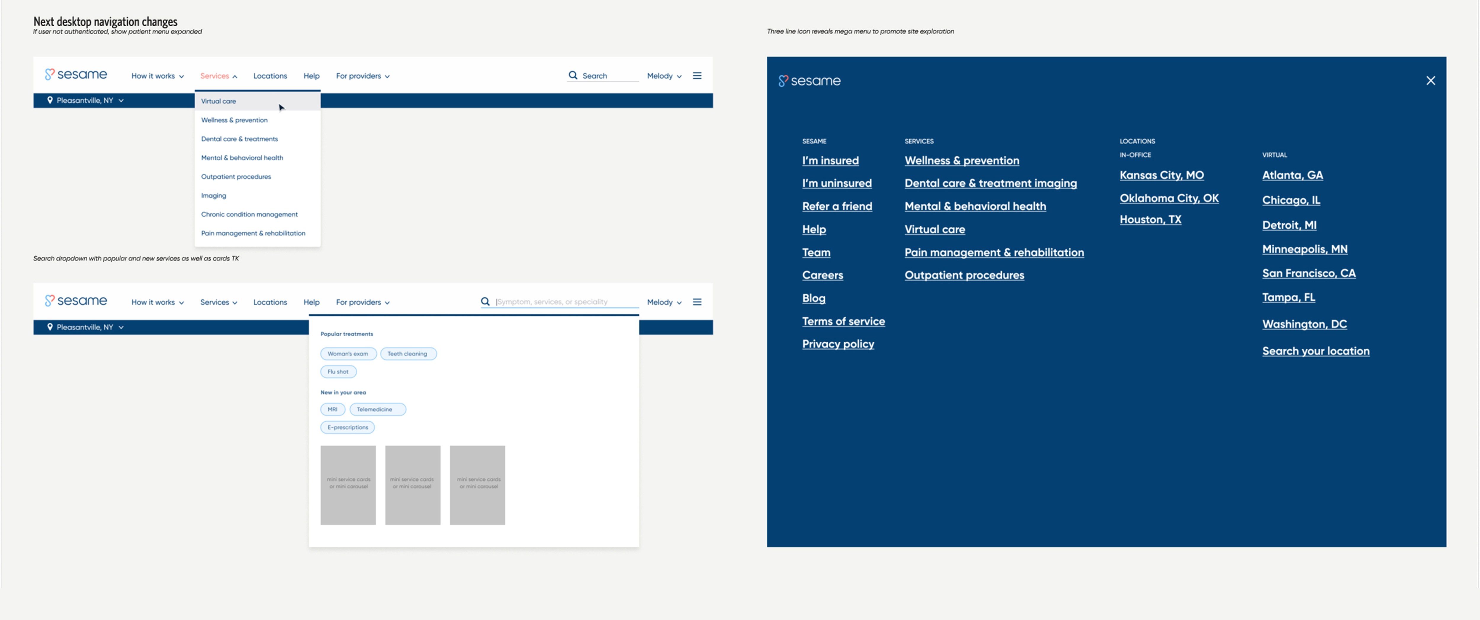
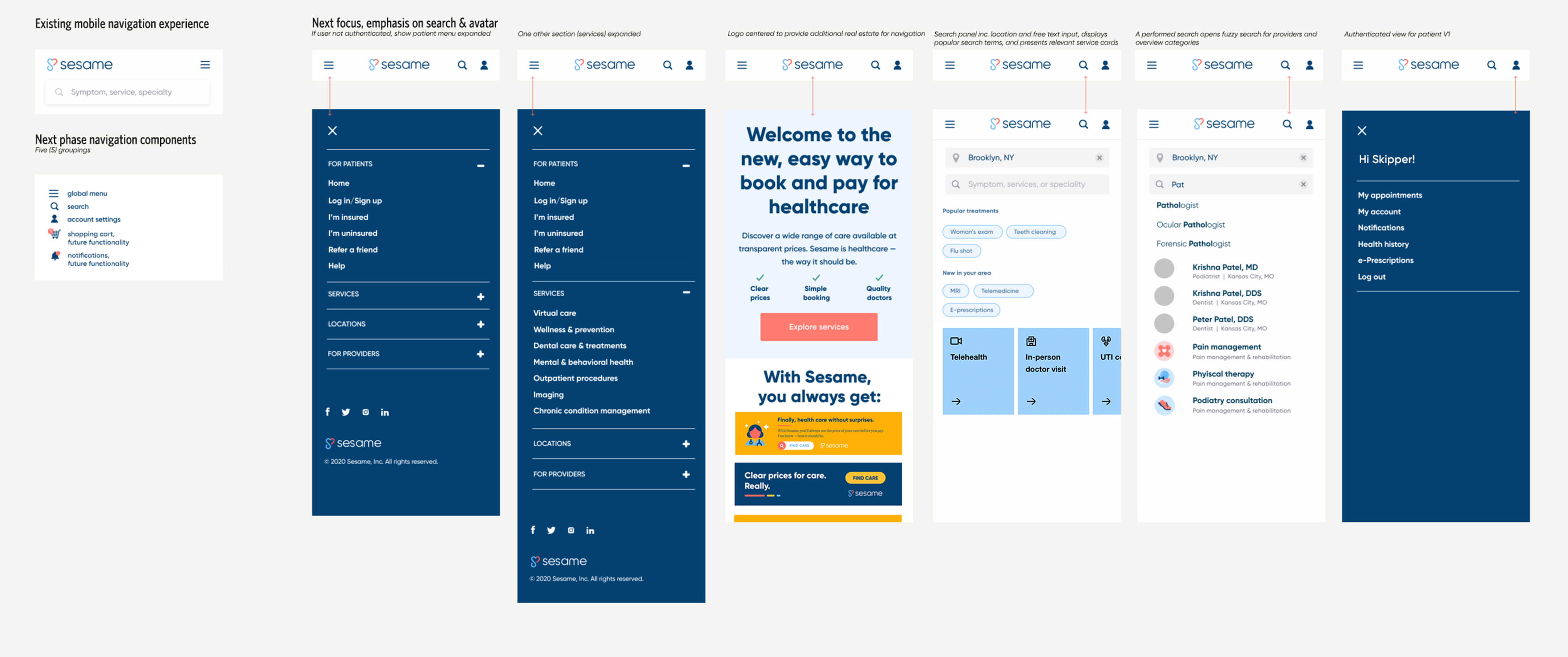
Once the beta was live, the product had to make room for more services, locations, search behavior, account states, and future features. We reworked navigation and filtering so the experience could grow without turning every new capability into another one-off pattern.
Desktop navigation. Making room for more services, locations, search, and site exploration.
Mobile navigation. Menu, search, and account states as the product surface expanded.
Cross-platform filtering. Translating the discovery model across desktop and mobile.
The designer I later hired, Melody, continued using Macaw after I left. Her later screens are her work; the useful signal is that the product system continued with the team that followed.
Impact
The dates held. We had a working prototype for JPM in January 2019 and launched the Kansas City beta afterward. By the time I left in August, the marketplace included approximately 500 providers.
The more useful outcome for me was the operating model. Research became a small recurring loop attached to shipping: ask, watch, change, build, test again.
Twenty-one conversations reduced enough uncertainty for a small team to keep making decisions. The business still had much more to prove.
The conversations were cheap, relatively. What they bought was shared evidence from a human who made healthcare decisions. When we changed a flow on Mon, nobody had to be convinced on Tue.